List Group component of Bootstrap is one of the flexible component used for listing a sequence of contents. The basic list of items indicates unordered list of item using a CSS impact. Several sub-components are supported by List Group components.
Initially, the basic example uses .list-group-item to list down all the items one by one. The other functionality is to turn the list activated. To active the list of items, convert the .list-group-item into .list-group-item active. Next, if you want to disable the list of items available then append the .list-group-item to .list-group-item disable.
To change the look of the List Group or to format it, you can use either a hyperlink or button element. You can use the anchor tag, or button tag to add various effects like hover, disable, and active state.
You can add flush functionality to eliminate some rounded corners or cut the side edges. If you want to implement a numbered list then it is possible by adding .list-group-numbered class. For building a sub-heading, you can use the same functionality. A .list-group-horizontal class can be used for displaying the content as in horizontal view.
The look of a list group can be changed frequently using various action control tools like badges, contextual classes, radio buttons, and checkboxes. The List Group component can also be viewed using JavaScript attributes or methods like a constructor.
For Example,
<ul class="list-group"> <li class="list-group-item">Lily</li> <li class="list-group-item">Rose</li> <li class="list-group-item">Sunflower</li> <li class="list-group-item">Jasmine</li> <li class="list-group-item">Lotus</li> </ul> |
|
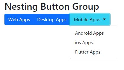
Create Grouped buttons and nested groups example